Button
The button element provides a push button widget. Some elements like Legend, Layertree, FeatureInfo, Line/Area Ruler and PrintClient need a button to be displayed/activated if not defined in a frame.
Buttons optionally can be grouped, so that only one button in a group can be active at any given time. This is done by the group paramter.
You can define a button that refers to a website or script using the click paramter.
Configuration
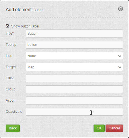
YAML-Definition:
title:        # title
tooltip:      # text to use as tooltip
icon: ~       # icon CSS class to use
label: true   # false/true to label the button, default is true
target: ~     # title (Id) of target element
click:        # refer to a website or script like http://mapbender3.org
group: ~      # group to put the button into. Only one button per group can be active
action: ~     # method of target to call when button is activated
deactivate: ~ # method of target to call when button is deactivated
Class, Widget & Style
- Class: Mapbender\CoreBundle\Element\Button
- Widget: mapbender.mbButton (mapbender.element.button.js)
- Style: mapbender.elements.css
HTTP Callbacks
None.
JavaScript API
activate
Activates button. Gets called on click if button is deactivated.
deactivate
Deactivates button. Gets called on click if button is active or when another button of the same group gets activated.
JavaScript Signals
None.