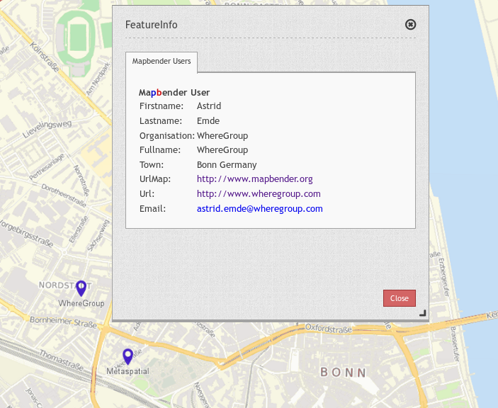
Feature Info
This element provides feature info capabilities to Mapbender3. It works for WMS services.
Configuration
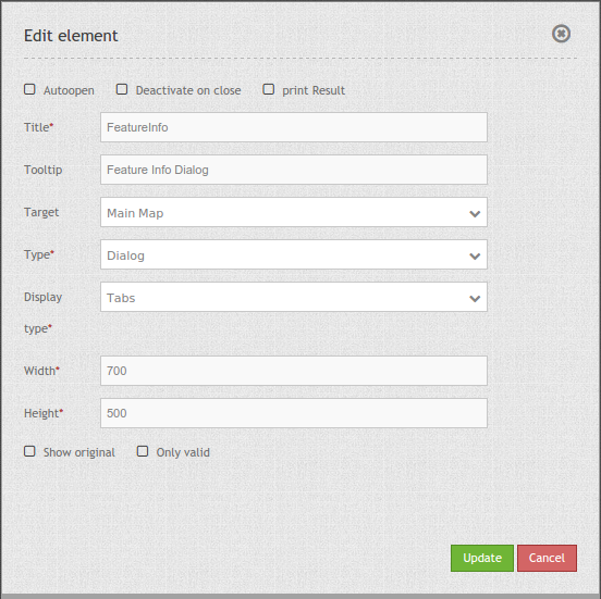
- Autoopen: Enable or disable autoopening of the copyright window, when starting the application, default is disabled.
- Deactivate on close: true/false to deactivate the functionality after closing the result dialog, default is true.
- Print Result: offer a link to print the result of the featureInfo, default is false.
- Title: Title of the element. It will be indicated next to the button.
- Tooltip: Text used as a tooltip. It will be indacted when hovering with the mouse cursor over the button. It also used as a header in the copyright window.
- Target: Id of Map element to query.
- Type: Type of the information, Element or Dialog.
- Display: Display of the information, Tabs or Accordion.
- Width/ Height: width/ height of the dialog in px, default is 700/500.
- Show original: show the css-style of the original feature info result, default is false.
- Only valid: The parameter “Only valid” highly depends on the format of the GetFeatureInfo response. Example UMN: as long as the template defines a correct HTML head and body element (for example by referencing a header and footer file), Mapbender3 will interpret the result as valid. Are these head and body elements missing, Mapbender will interpret the result as not valid. Please make sure, that the GetFeatureInfo Response is a valid HTML.
Note: It is possible to load WMS services dynmically into the application Via the information response of a FeatureInfo dialog. The WMS Loader is used for that feature. For further information take a look in the chapter How to add a WMS by defining a link.
YAML-Definition:
tooltip: Feature Info   # text to use as tooltip
target: ~               # Id of Map element to query
autoOpen: false         # true/false open when application is started, default: false
deactivateOnClose: true # true/false to deactivate the functionality after closing the result dialog, default is true
width: 700              # width of the dialog, default is 700
height: 700             # height of the dialog, default is 500
printResult: false      # offer a link to print the result of the featureInfo, default: false
showOriginal: null      # show the css-style of the original feature info result, default: false
onlyValid: null         # , default: false
You need a button to show this element. See Button for inherited configuration options.
Class, Widget & Style
- Class: Mapbender\CoreBundle\Element\FeatureInfo
- Widget: mapbender.element.featureInfo.js
- Style: mapbender.elements.css
HTTP Callbacks
None.
JavaScript API
activate
Activates the widget which then waits for mouse click on the map and starts the feature info queries.
deactivate
Deactivates the widget.
JavaScript Signals
None.