Overview
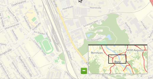
The Overview element provides a control of an overview map, similar to the OpenLayers Overview control. This element though is easier to use when custom styling is needed.
You can define the size of your overview window and a position. Refer to a layerset that you defined before for the services to display in the overview map. The overview map can be fixed or can zoom when you zoom in/out in the main map. You also can define whether the overview map is minimized or maximized on start of the application.

Configuration

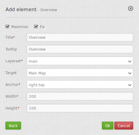
- Maximize: true/false to open/close on start, default is true.
- Fix: true/false to fix the overview extent, default is true.
- Title: Title of the element. The title will be listed in “Layouts” and allows to distinguish between different buttons. It will be indicated if “Show label” is activated.
- Tooltip: text to use as tooltip.
- Layerset: refer to a layerset f.e. overview, define the layerset first and refer to it.
- Target: Id of Map element to query.
- Anchor: overview alignment, default is ‘right-top’.
- Width/ Height: overview width and height.
YAML-Definition:
tooltip: 'Overview'              # text to use as tooltip
target: ~                        # Id of Map element to query
layerset: ~                      # refer to a layerset f.e. overview, define the layerset first and refer to it
width: 200                       # overview width
height: 100                      # overview height
anchor: 'inline'/'left-top'/     # overview alignment, default is 'right-top'
  'left-bottom'/'right-top'/     # use inline f.e. in sidebar
  'right-bottom'
position: array('0px','0px')     # overview position in relation to anchor, default: x=0px, y=0px
maximized: true                  # true/false to open/close on start, default is true
fixed: true                      # true/false to fix the overview extent, default is true
Class, Widget & Style
- Class: Mapbender\CoreBundle\Element\Overview
- Widget: mapbender.element.overview.js
- Style: mapbender.element.overview.css
HTTP Callbacks
None.
JavaScript API
None.
JavaScript Signals
None.
