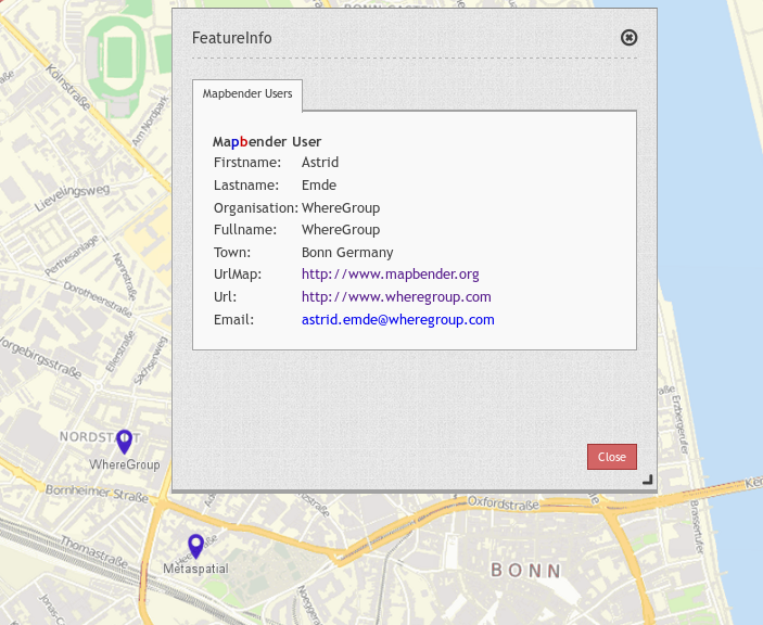
Feature Info
This element provides feature info capabilities to Mapbender3. It works for WMS services.
Configuration
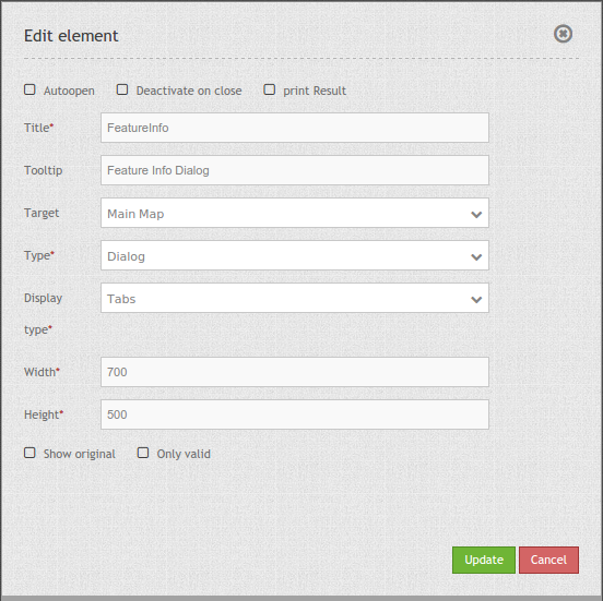
Note: The parameter “Only valid” highly depends on the format of the GetFeatureInfo response. Example UMN: as long as the template defines a correct HTML head and body element (for example by referencing a header and footer file), Mapbender3 will interpret the result as valid. Are these head and body elements missing, Mapbender will interpret the result as not valid. Please make sure, that the GetFeatureInfo Response is a valid HTML.
YAML-Definition:
tooltip: Feature Info   # text to use as tooltip
target: ~               # Id of Map element to query
autoOpen: false         # true/false open when application is started, default: false
deactivateOnClose: true # true/false to deactivate the functionality after closing the result dialog, default is true
width: 700              # width of the dialog, default is 700
height: 700             # height of the dialog, default is 500
printResult: false      # offer a link to print the result of the featureInfo, default: false
showOriginal: null      # show the css-style of the original feature info result, default: false
onlyValid: null         # , default: false
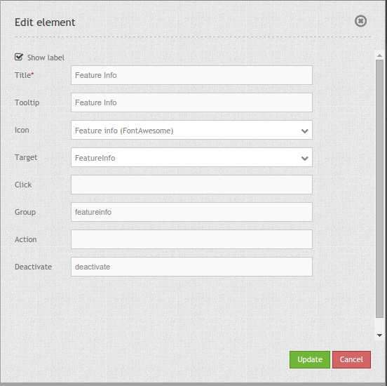
You need a button to show this element. See Button for inherited configuration options. The following screenshot shows an example for a FeatureInfo Button which is shown activated as long the FeatureInfo dialog is displayed.
Class, Widget & Style
- Class: Mapbender\CoreBundle\Element\FeatureInfo
- Widget: mapbender.element.featureInfo.js
- Style: mapbender.elements.css
HTTP Callbacks
None.
JavaScript API
activate
Activates the widget which then waits for mouse click on the map and starts the feature info queries.
deactivate
Deactivates the widget.
JavaScript Signals
None.